
Maintenance
Part of 6 pointers on neon sign restoration that hold up
The corners, not the letters: what people miss about neon sign restoration
Standing under a restored sign, most people look at the letters. Nearly everything worth knowing is in the corners, the cabinet and the wall behind.
What to take away
- Look at the corners of the letters. Tight bends mean a faithful remake; softened ones mean a repair from a photograph.
- The cabinet tells you more than the tubes. Paint, seams and patches record every intervention.
- Count the colors. A restoration that lost a color is common and almost never mentioned.
- Look at the wall or pole behind the sign, and at what the sign was mounted to originally.
A restored neon sign in daylight looks like a big painted box with glass tubes on it. That is exactly what it is, and the box is where the evidence lives.
Once you know what to look at, you can tell a careful restoration from a rushed one in about a minute, without asking anybody.
The corners give it away
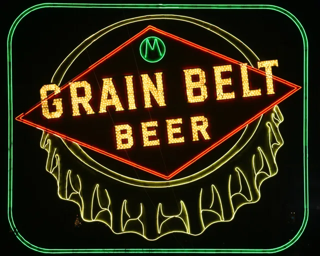
Neon tubing is bent by hand over a flame. Sharp interior corners on letters are difficult, slow and expensive.
When a sign is remade from a good pattern, the corners match the original lettering. When it is remade from a photograph, corners soften, serifs disappear and the curves become slightly generous. The word still reads, and the character is quietly gone.
Compare the letterforms on the tubing with any painted lettering surviving on the cabinet. They were drawn by the same person originally, and a mismatch tells you which one is new.
Count the colors
Older signs frequently used more colors than their restored versions: a second color for an outline, a third for an accent that flashed.
Restoration budgets get cut, and a color is the easiest thing to cut, because nobody who has not seen the original knows it is missing. Look for empty channels, unused electrode housings or paint shadows where a tube used to sit.
The cabinet is the document
The sheet metal box holds the whole history of the sign: the original paint under later coats, patches where a section was replaced, the seams that reveal which parts were made together, filled holes where something used to mount.
A good restoration leaves this legible. A poor one wraps everything in a new skin, and you lose the ability to tell what happened.
Look at the back too, where nobody paints. That is usually the most honest surface on the whole object.
What is behind the sign counts
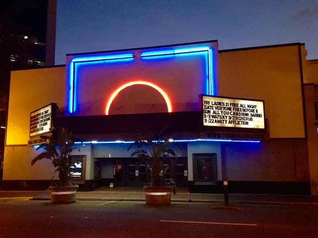
Signs of this era did not stand alone. They belonged to a shopfront that was designed with them, and the wall behind is part of the composition.
Many of these buildings used pigmented structural glass, glossy colored panels sold under names like Vitrolite. The National Park Service brief on preserving historic pigmented structural glass covers how it was used and how it fails.
Cracked, mismatched, or painted-over panels behind a beautifully restored sign signal a storefront project that ran out of money before it finished.
The sign and the shopfront are one design. Judging them separately is what first-time visitors do.
Where the good examples are
Concentrations matter, because seeing four signs on one street teaches you more than four signs in four states.
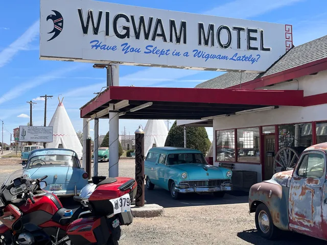
The National Park Service's account of Route 66 in Illinois is a useful starting point for the northern end of the corridor, where the road runs through towns that kept their commercial frontages rather than losing them to a bypass. Reading a corridor's history first tells you why some towns have surviving signs and others have none.
Five things to check in the first minute
Five things to check
- Are the letter corners sharp or soft?
- Is there evidence of a missing color?
- Does the cabinet show its history, or has it been wrapped?
- Is the mounting original, or is the sign on a new pole?
- Does the building behind match the standard of the sign?
After dark is a different object
A sign photographed only in daylight is half recorded, and the night version hides all the evidence above.
Which is why the two visits are both worth making, and why the daylight one is the one people skip. The sequence for doing both properly is in the neon field list, and what all this work costs explains most of the compromises you will spot.